As part of my work with Avie, I designed an onboarding experience for new and returning patients.
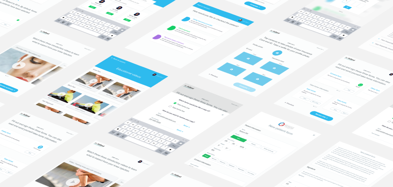
I defined three different user flows (new patients, returning patients, and configuration by staff) and delivered 26 screens that showed the various steps and states in the system. I also redesigned five of the standard intake and consent forms traditionally given to patients.
With this onboarding system in place, patients complete forms faster and with less effort, and their time spent in waiting rooms becomes an opportunity to be educated about procedures and treatments.
Problem Definition
We noticed that onboarding was a point of frustration for both patients and clinics Filling out paper forms is tedious, and after forms are completed, patients are often left wondering what to expect while they wait for their doctor to arrive.
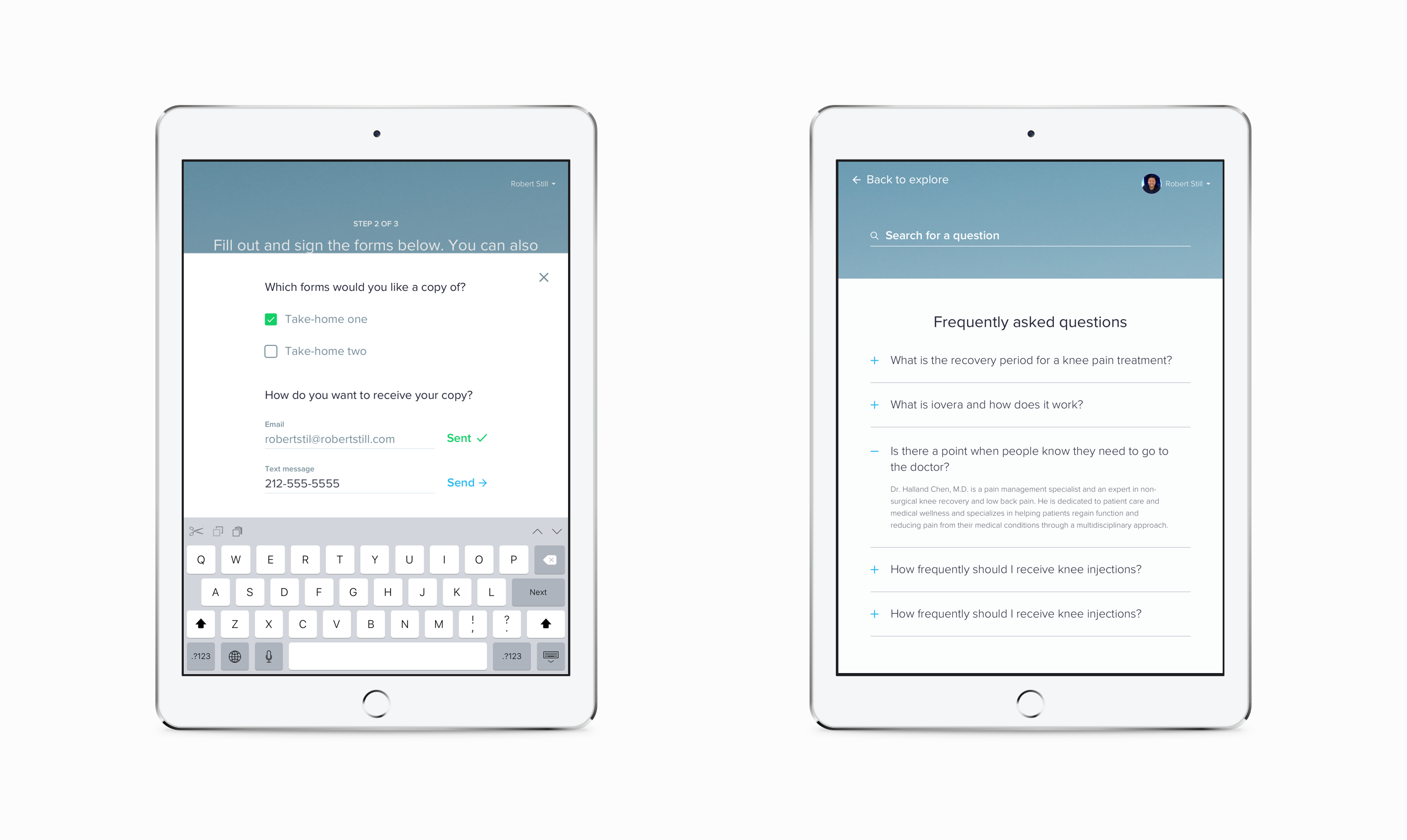
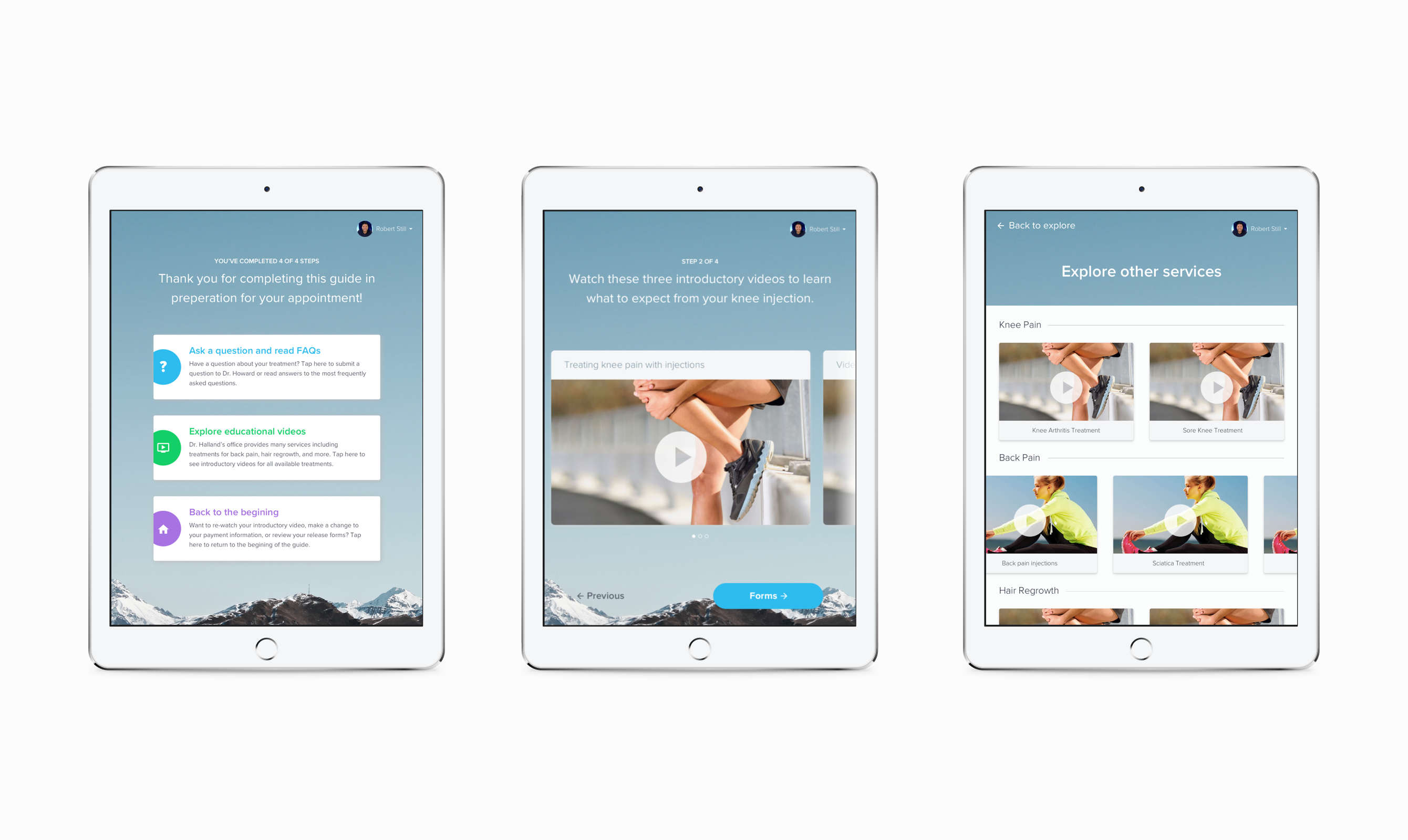
To solve for these pain points we needed to do more than digitize paper forms. We needed a system that would guide patients each step of the way and address questions or concerns about their appointment. Each flow would have to display content that's relevant to a patient's procedure or treatment—things like forms, service summaries, educational videos and take-home information.
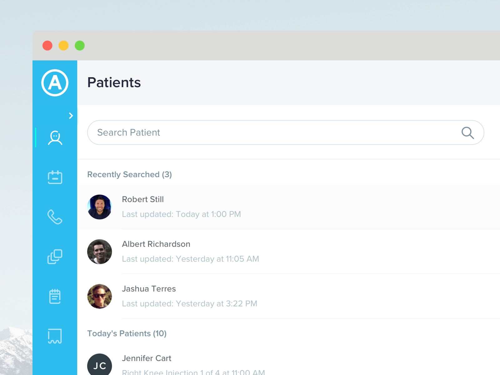
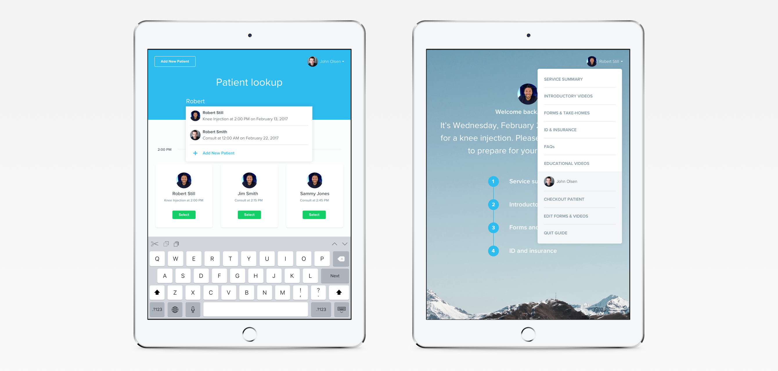
In addition to the onboarding flows for patients, we also needed a way for staff to configure the experience on a per-patient basis.
Reducing Complexity
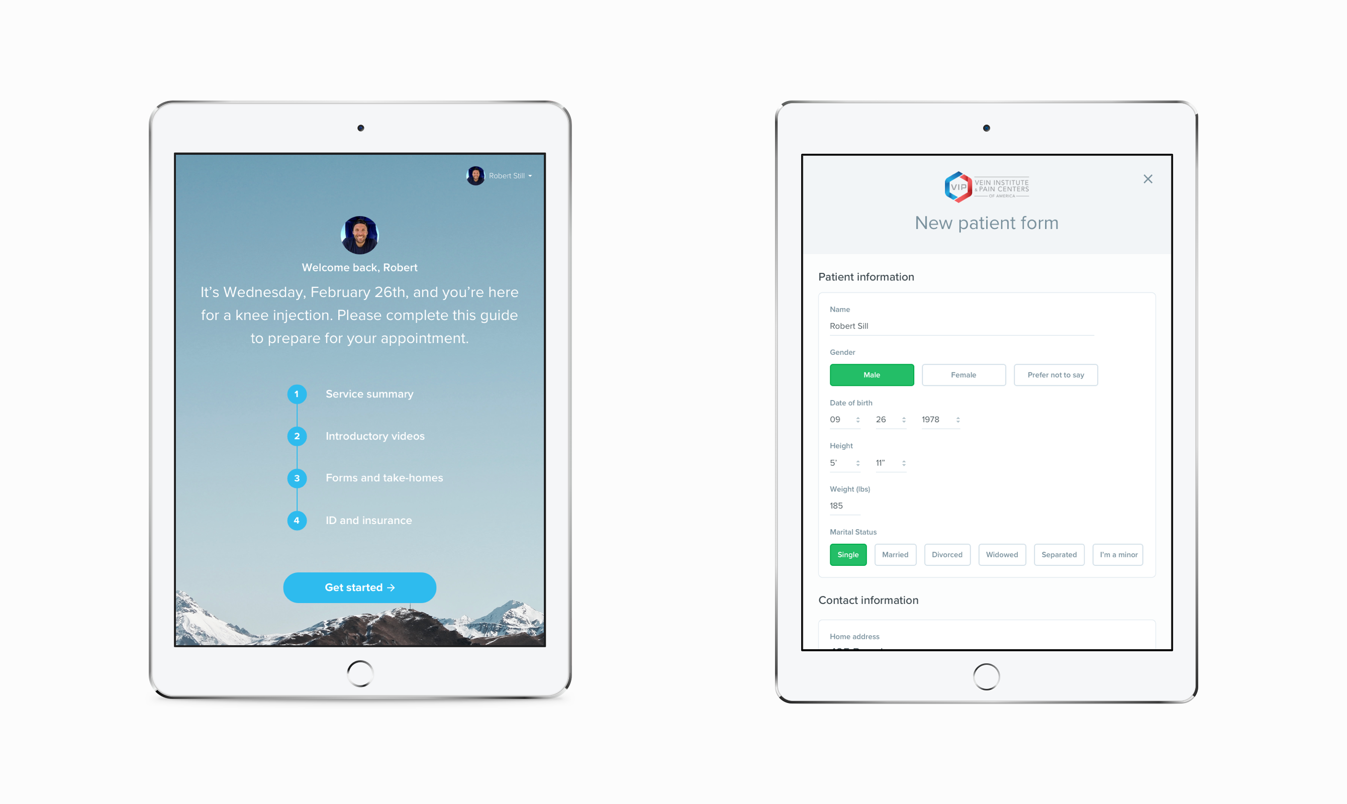
I was able to group complex tasks and present them as a single step, on a single screen By chunking tasks into 3-4 steps like this was to make onboarding feel more manageable for patients. Four steps feels easier than 25, even if the effort required is the same. And progression feels more meaningful as well.
Designing for Flexibility
Each step is a module that can be configured for each patient As a result, the system can adapt to the varying needs of different clinics and patients. To a similar end, I used cards to display a variety of content formats while maintaining visual consistency throughout the experience.
Copy and Interactions
I used copy and interactions to guide and reassure patients as they progressed through the onboarding flow The welcome page confirms a patient's scheduled procedure and gives an overview of the onboarding steps. And, rather than use generic language, the progress button labels describe the next step in the flow.
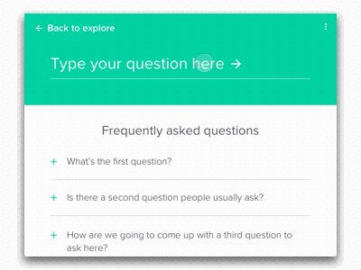
When sending a form, the button label text transitions from “Send” to “Sent” and the text color transitions from blue to green. And in the FAQ section, a patient gets visual confirmation when then submit a question.