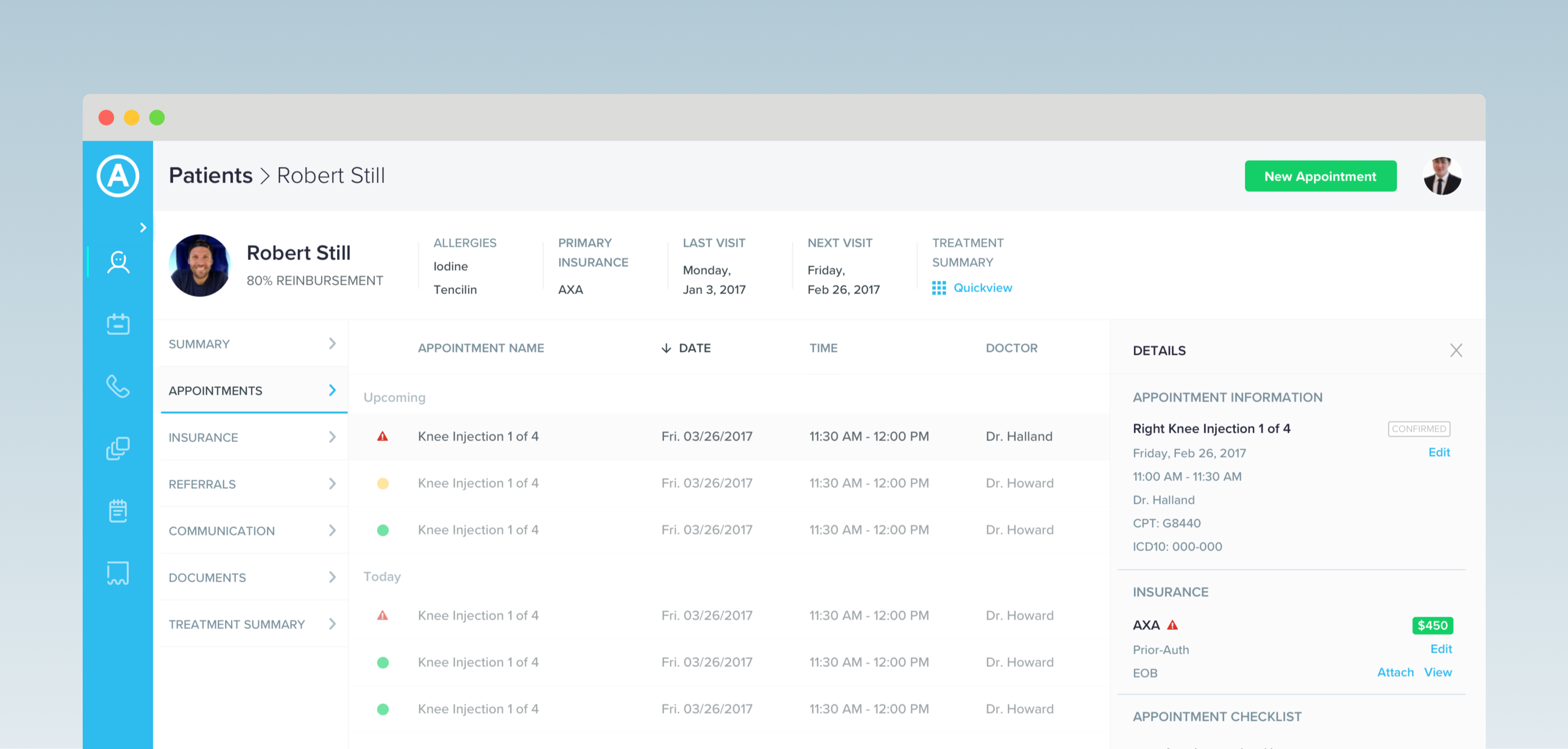
I worked with a medical clinic to design a web-based CRM tool for streamlining their workflow. I also delivered a component-based design spec that guided development.
Getting Started
First I spoke with doctors and clinic staff to learn what information they use to make decisions and actions they take The clinic was tracking CRM information with a handful of spreadsheets and systems that didn't work well together. This way of managing information was inefficient and sometimes led to unbooked treatments, denied insurance claims, and missed opportunities to serve patients.
Clinic staff needed to perform the following tasks: finding and editing patient profiles, scheduling appointments, initiating insurance authorizations, and contacting patients via phone, email, or text message.
My challenge was to organize patient information to be accessible and readable. I'd also have to make it easy for staff to take action from anywhere within the application, in context of the information at hand.
Explorations
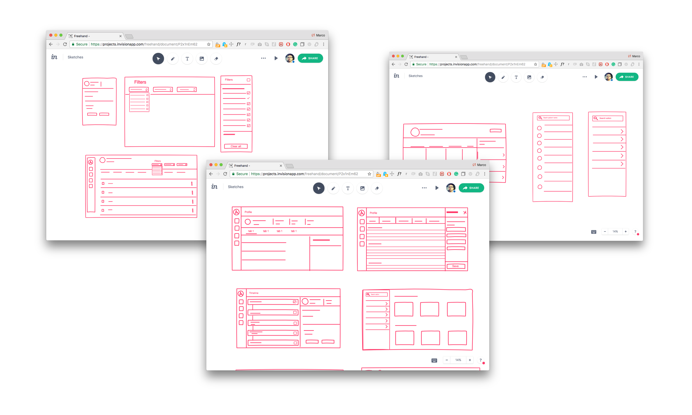
With tasks and workflows roughly defined, I sketched and evaluated different patterns for navigation and content organization I was able to quickly explore a range of options and think through the pros and cons of different patterns for layout, hierarchy, and navigation before moving into higher fidelity.
Iteration and Refinement
I went from concept sketches into high-fidelity, and worked with the clinic to iterate and refine the designs based on their feedback Below are a some of the design decisions I worked through with the clinic:
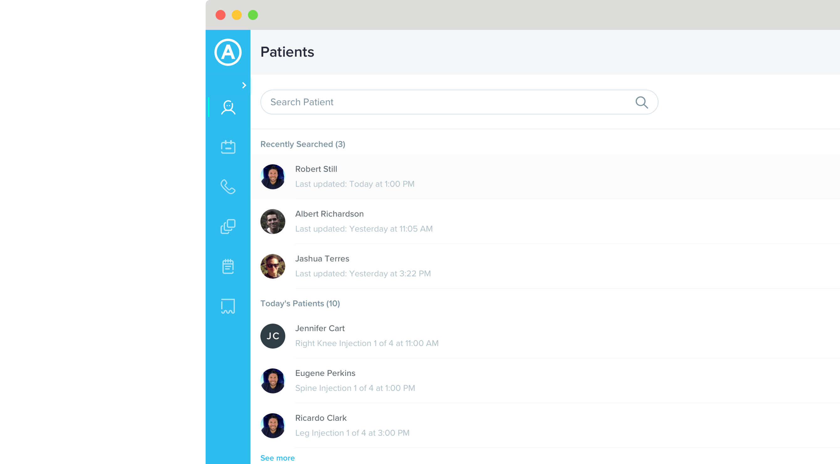
Patient Lookup
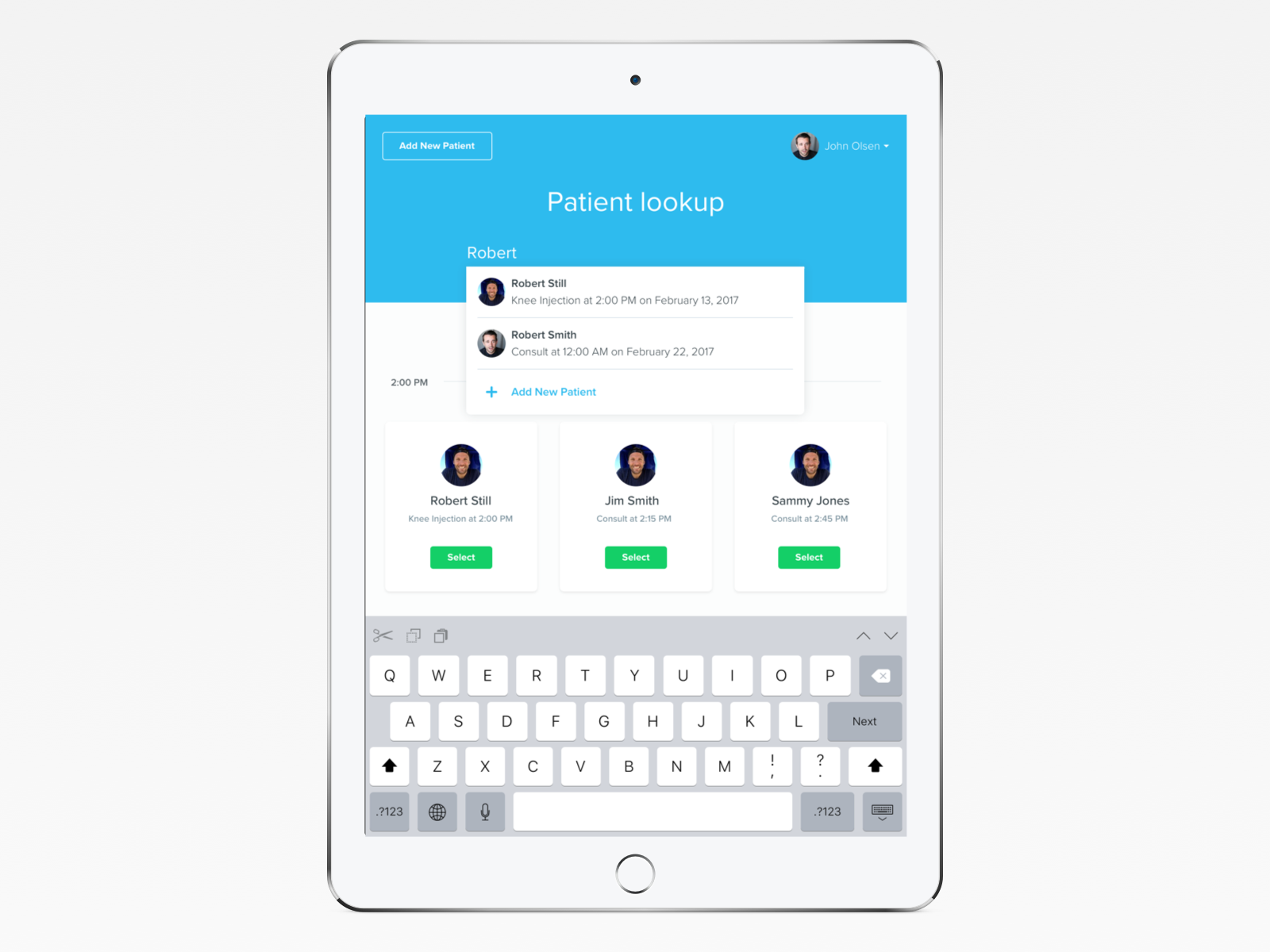
To make patient lookup more actionable, I grouped patients into task-oriented categories, rather than display them as a single list.
Patient Profiles
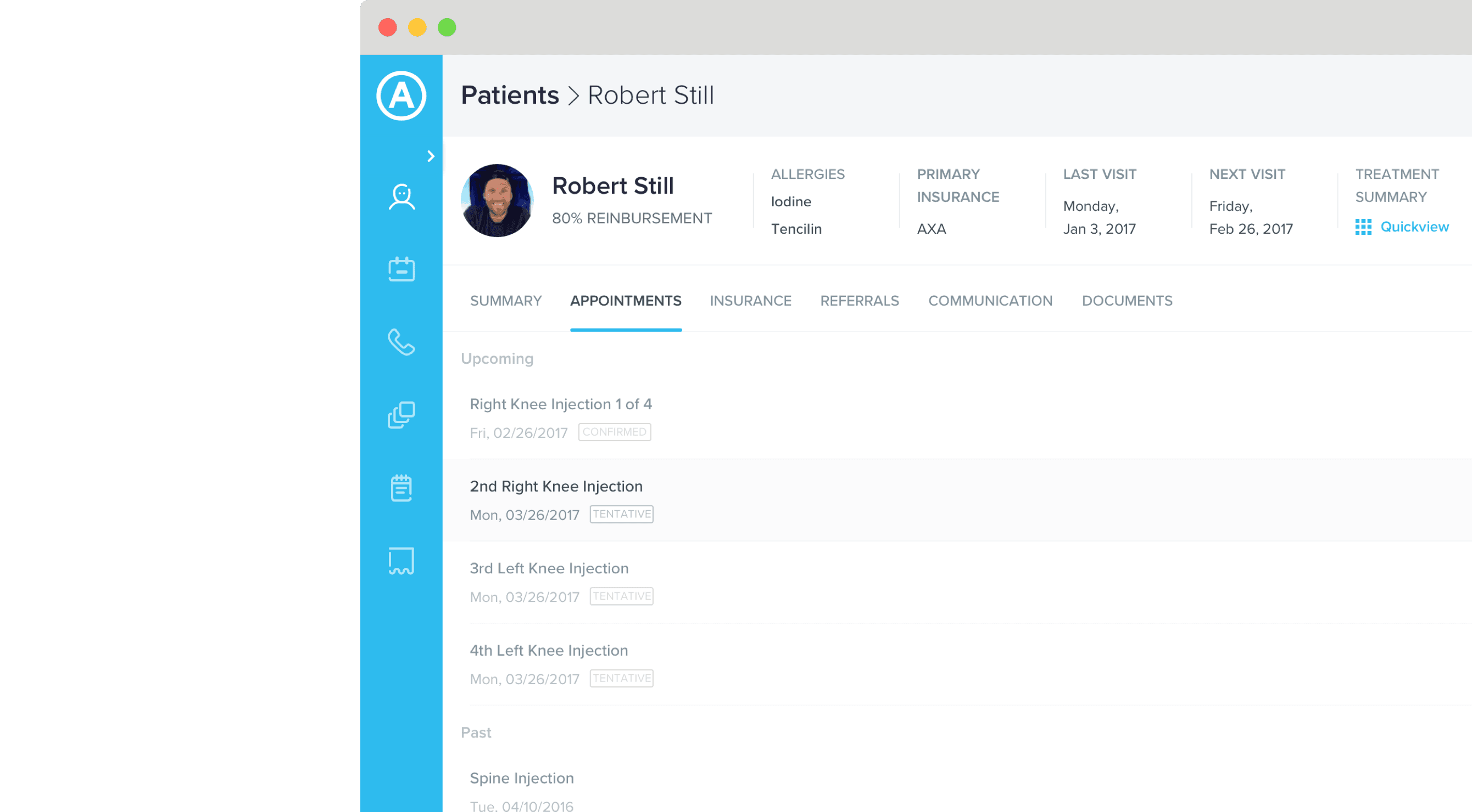
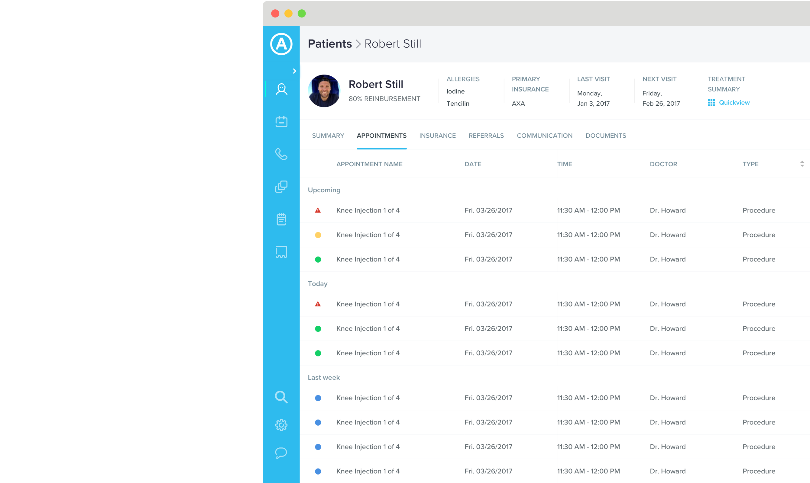
I designed a patient info header that summarizes the patient's most important information at a glance and lends itself to the F-shaped scanning pattern that comes naturally to most people.
Patient Data
To show more information at a glance, I used data tables instead of a list view, making it faster to sort through detailed patient data.
Contextual Filters
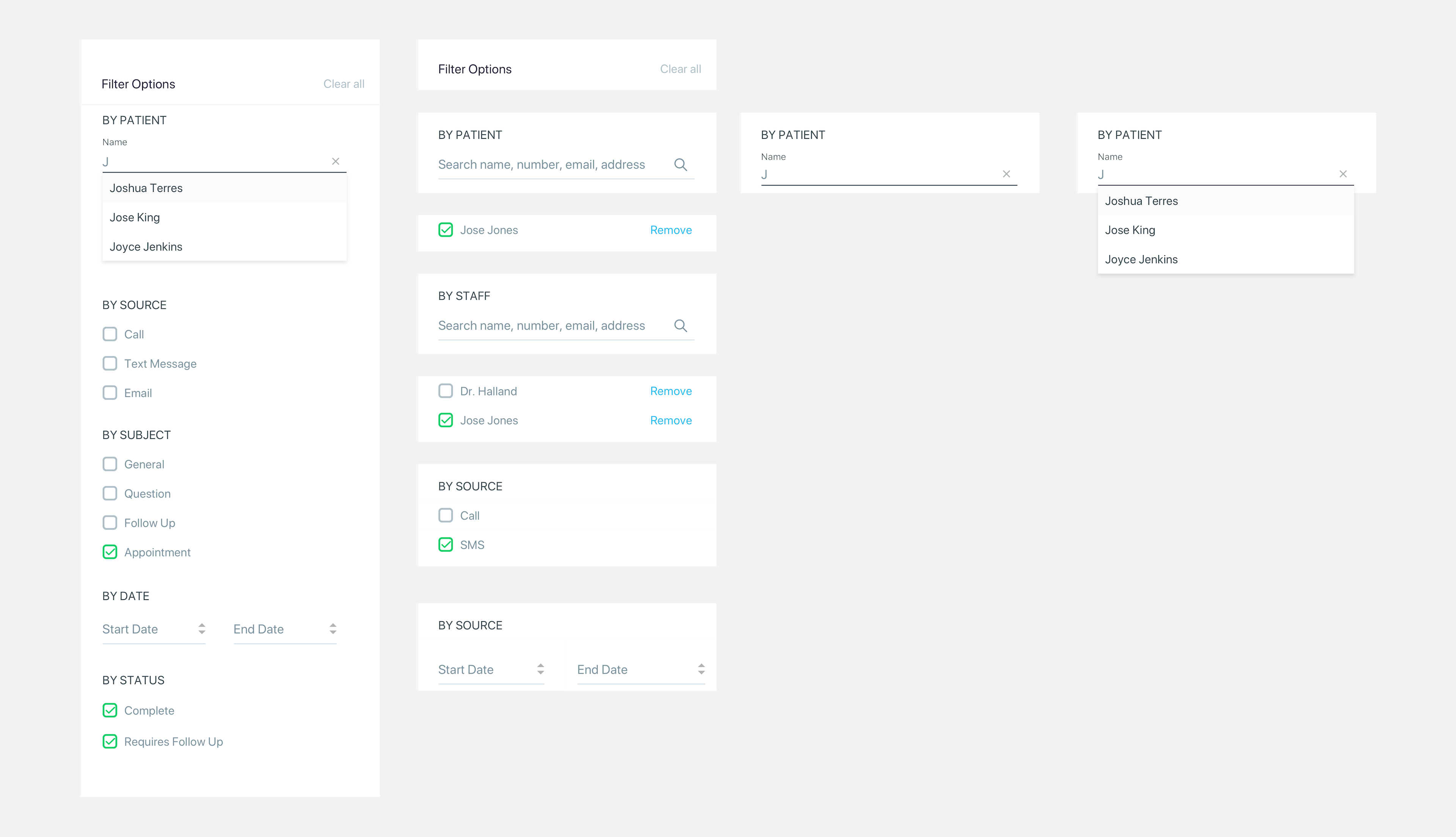
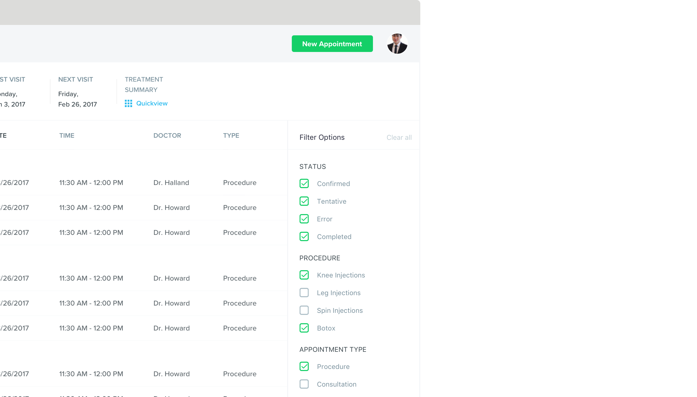
I displayed filter options in a persistent side panel to promote available options and make it clear which options are selected at any given time.
Quick Actions
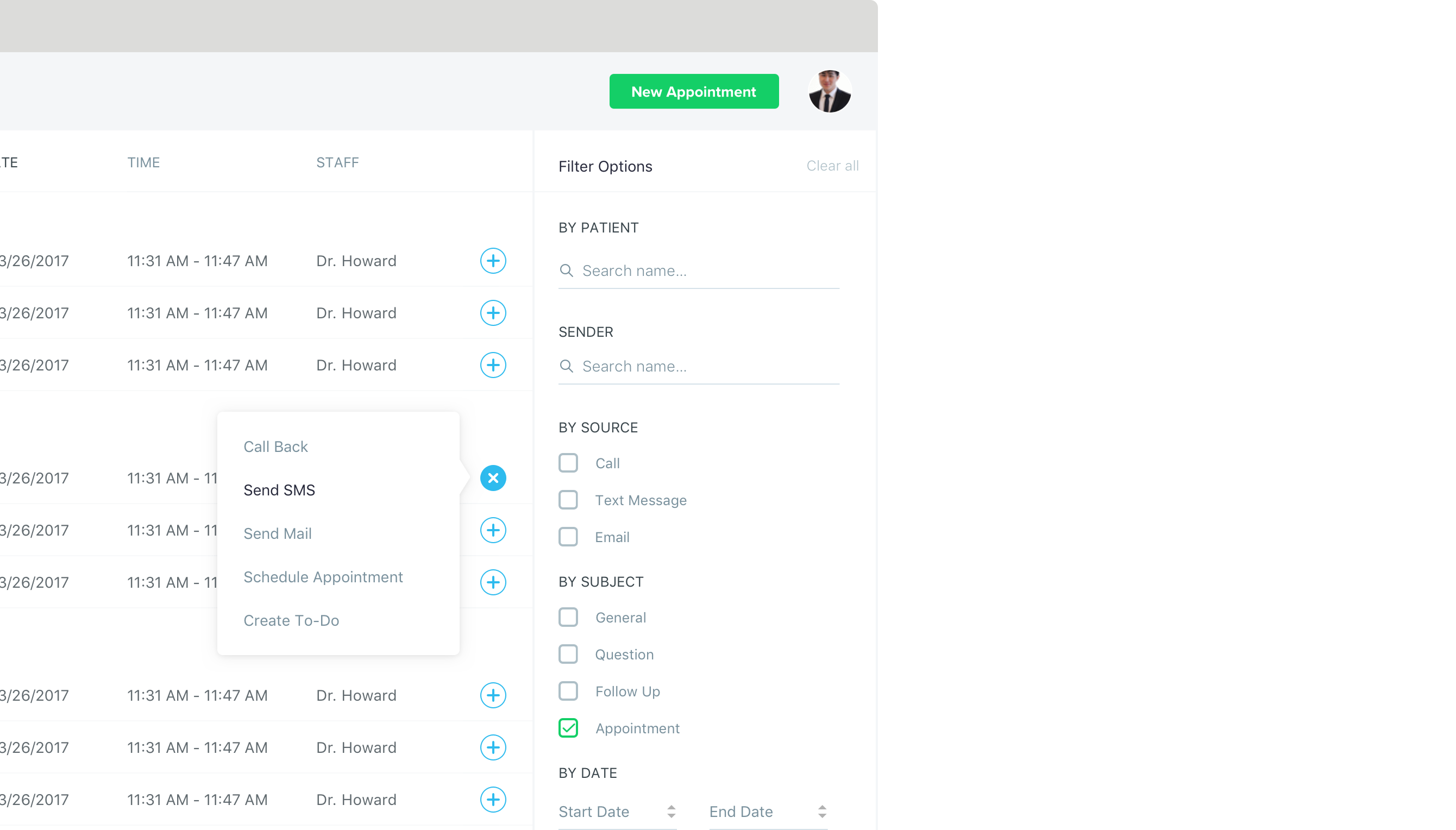
I used an action button in each row of the data table, making it easy for user to perform common tasks quickly and in context of the information they're looking at.
Style Guide
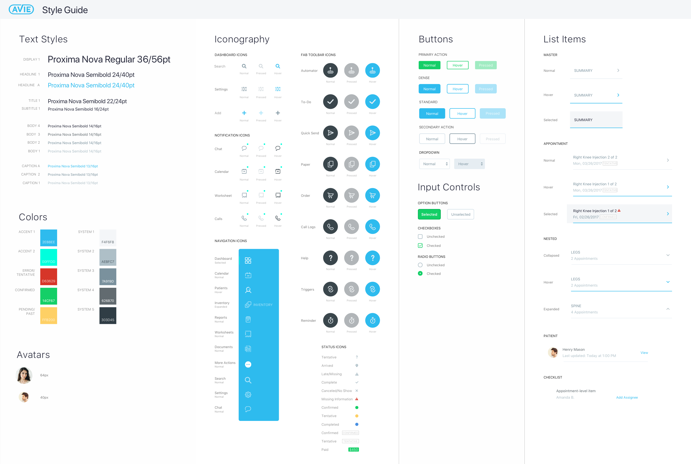
I also delivered a style guide that helped us consistently apply styles and UI elements across the application
Developer Handoff
To help guide development, I delivered specs for each UI element and their states Early on the developers and I talked about the concept for the UI. We were both thinking in terms of components and states, so it was natural to define specs in a similar way.
