As part of my work with Second Funnel, I helped design a web-based CMS that provided a way for marketers to configure and deploy custom eCommerce pages without having to change the code on their site.
The landing page UX Second Funnel provided was already increasing conversion rates by up to 5x over conventional eCommerce pages. The CMS would help scale that success by automating and streamlining our page deployment workflow.
Role and team
As the designer on our team, I interviewed customers, produced user flows and a sitemap, wireframes, and high-fidelity designs
Customer interviews
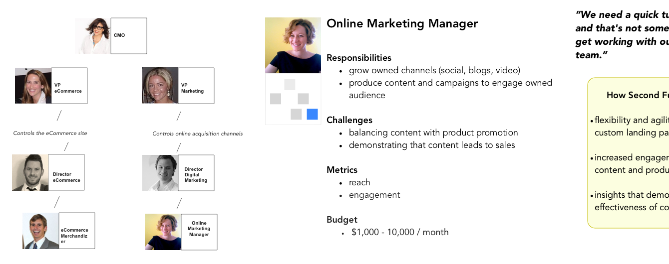
I met with our customers to understand how they worked within their organizations and how our product would fit into their workflow Our primary user type was a Digital Marketing Manager. This person was responsible for configuring and launching the landing page.
Workflows and tasks
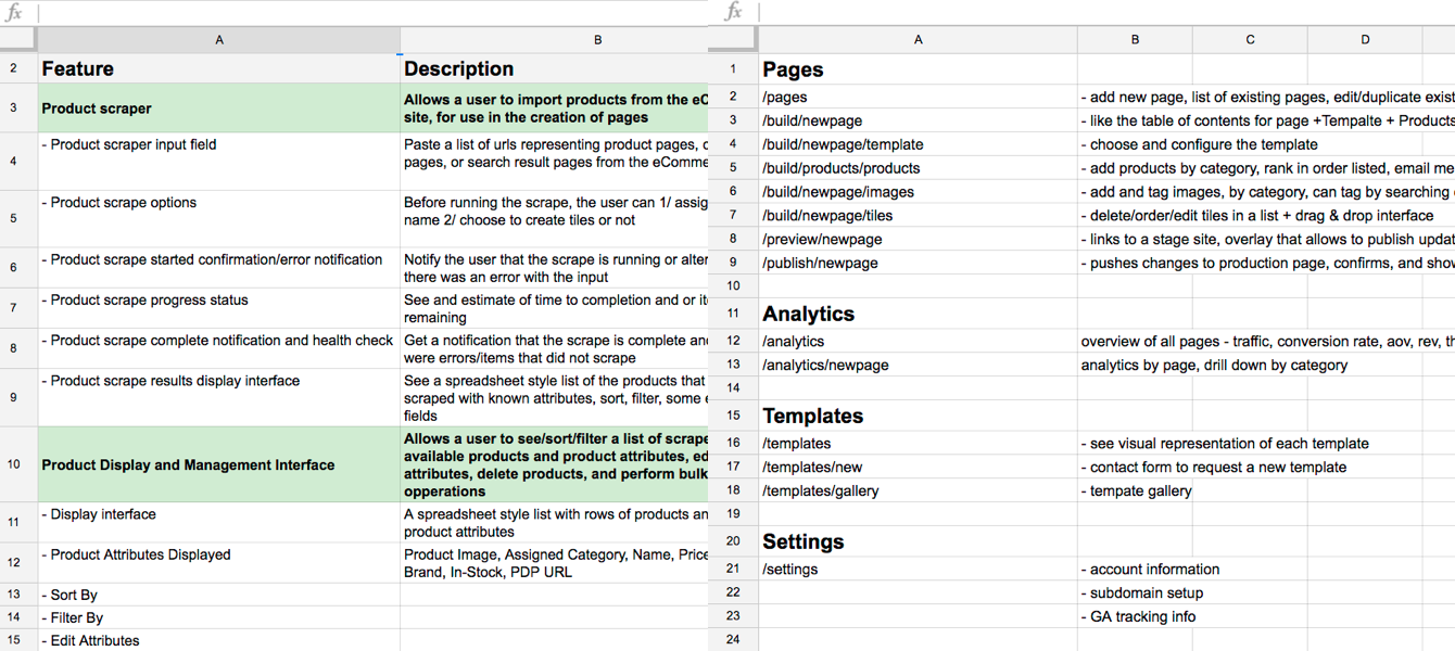
I mapped out a workflow and defined tasks and subtasks We translated them into feature requirements, and tracked everything in a Google spreadsheet.
To configure a landing page, the user would have to perform three major tasks:
- Import Content
- Tag Content
- Arrange Content
Sketches and prototypes
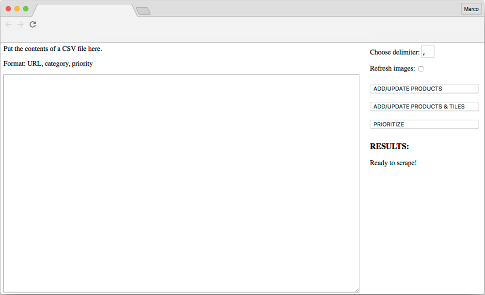
With the tasks and requirements in hand, I started sketching ideas for the UI From these early sketches we prototyped some key features. For example, we built a very basic interface for importing product data into our database that we used and tested internally.
Sitemap and user flows
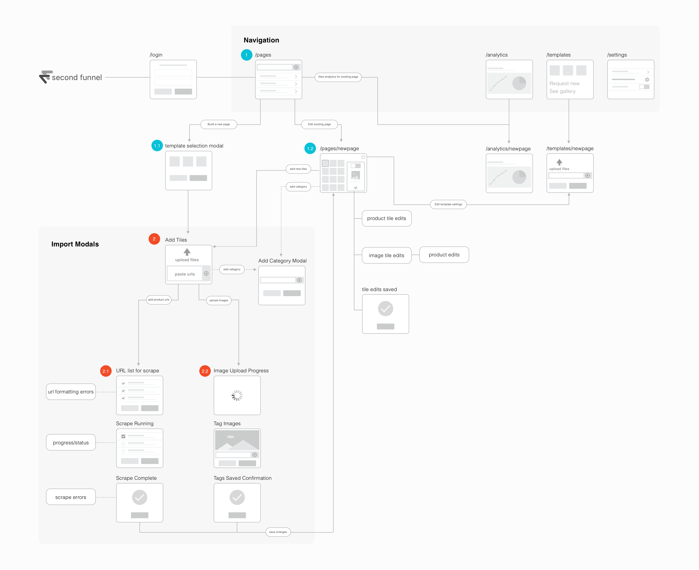
I defined the information architecture of the app and showed how a user would move through the application to complete tasks The sitemap shows the top-level navigation and the three flows that make up page configuration: importing, tagging, and arranging content.
Wireframes
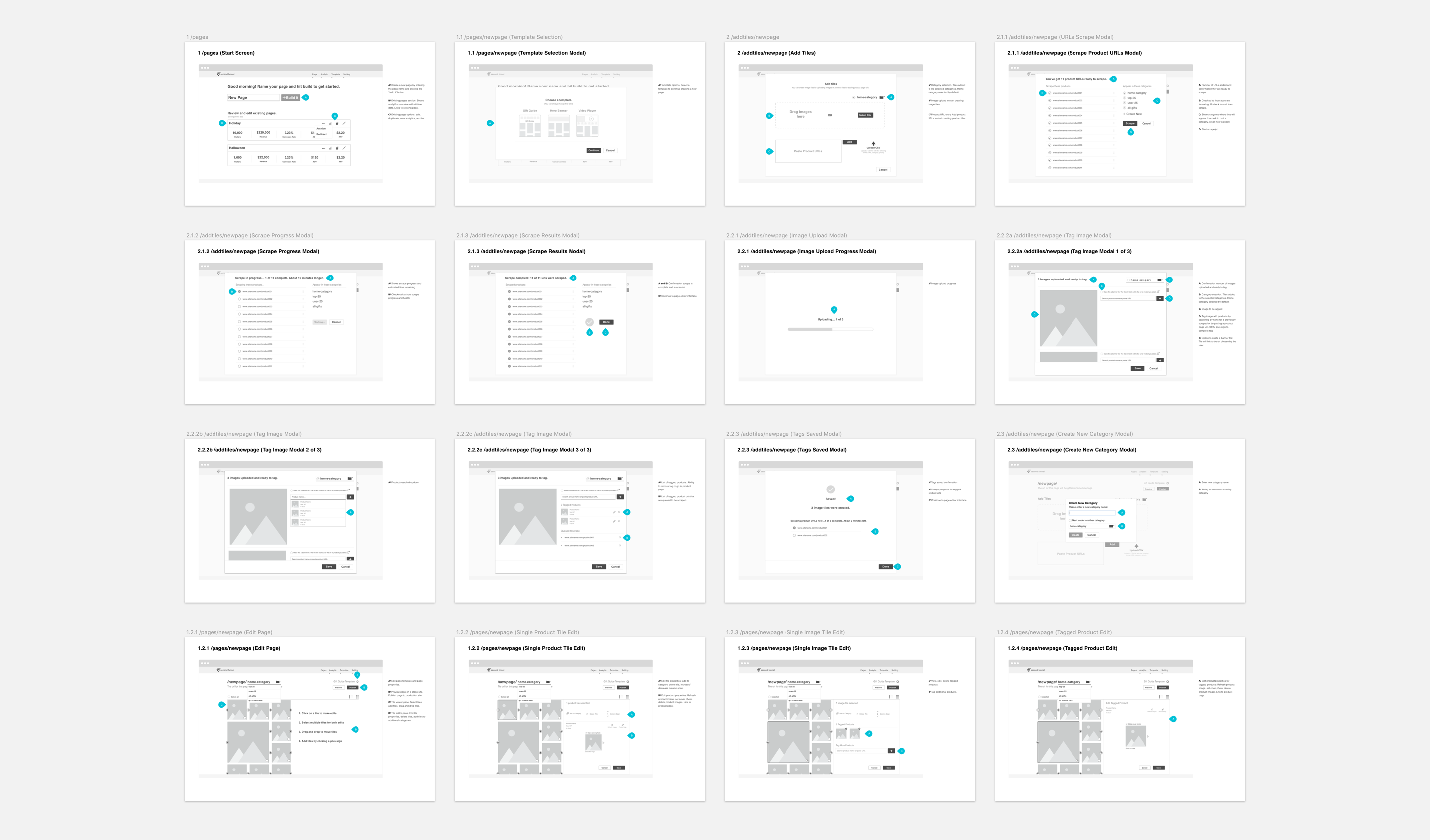
I created wireframes for the major tasks of selecting templates, and importing, tagging, and arranging content
Styles and components
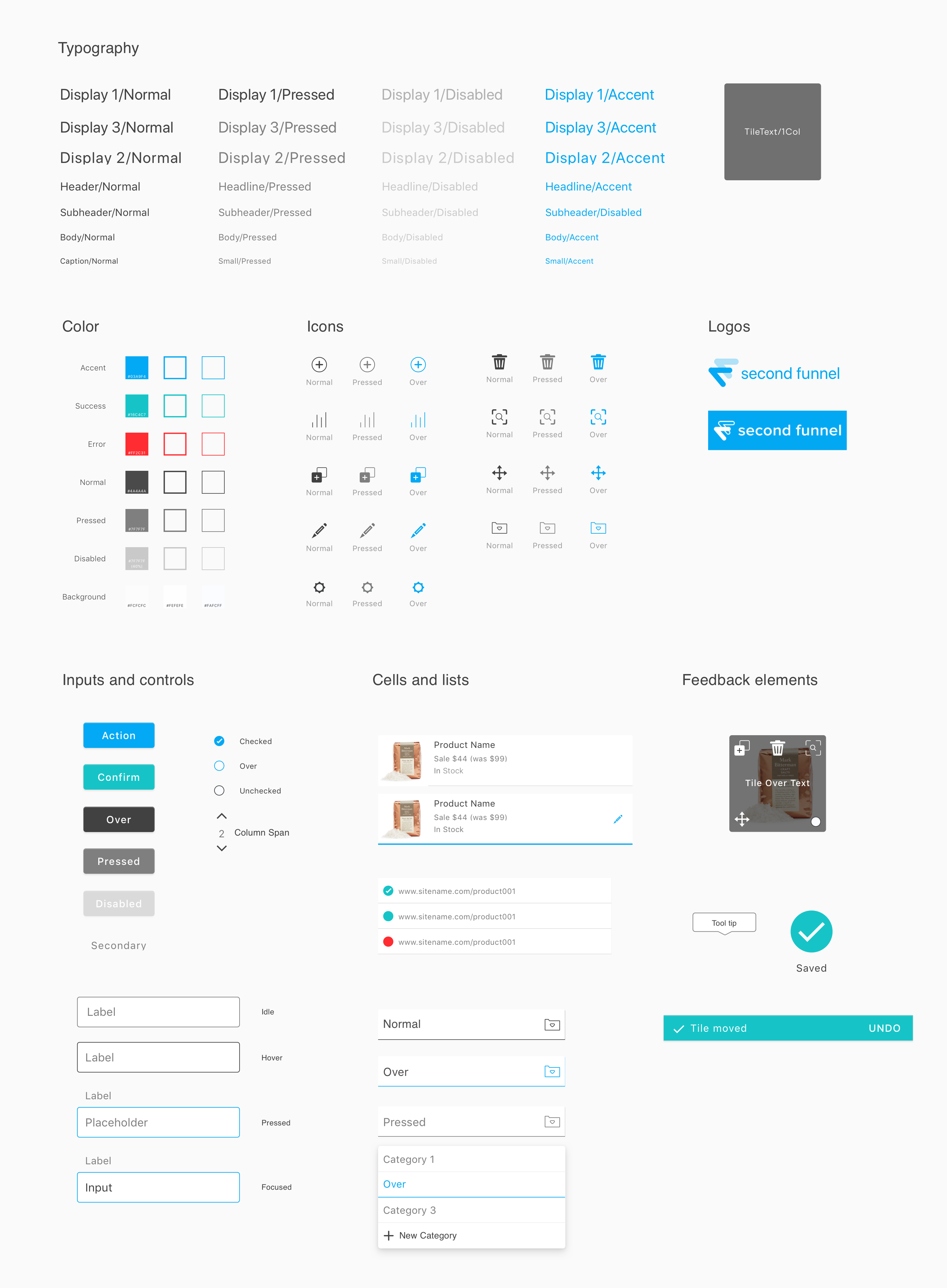
I put together a style guide and component library which I used to design the rest of the screens in high-fidelity The wireframes helped me define a set of UI elements. From here, I created symbols in Sketch and applied a basic set of shared styles to get me started. To come up with the visual styling, I referenced our product objectives and our visual identity.
Dashboard
Tile arrangement
Interactions
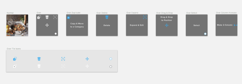
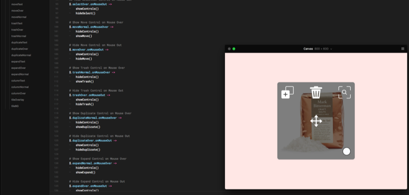
I experimented with different interactions and discovered a way to streamline content management By showing controls on hover instead of in a side menu, users could edit and arrange content faster, with less friction.
