An eCommerce experience designed for inspiration and discovery
Second Funnel is an eCommerce software startup I worked on. We provided a way for marketers to deploy custom eCommerce pages without having to change the code on their site. Rather than try to squeeze more conversion out of an existing purchase path, Second Funnel enabled an entirely new experience that was optimized for inspiration and discovery.
As a member of the founding team, I helped define our product, validated our early hypotheses, and designed an eCommerce UI that significantly increased conversion rate and time on site for our customers.
Outcome
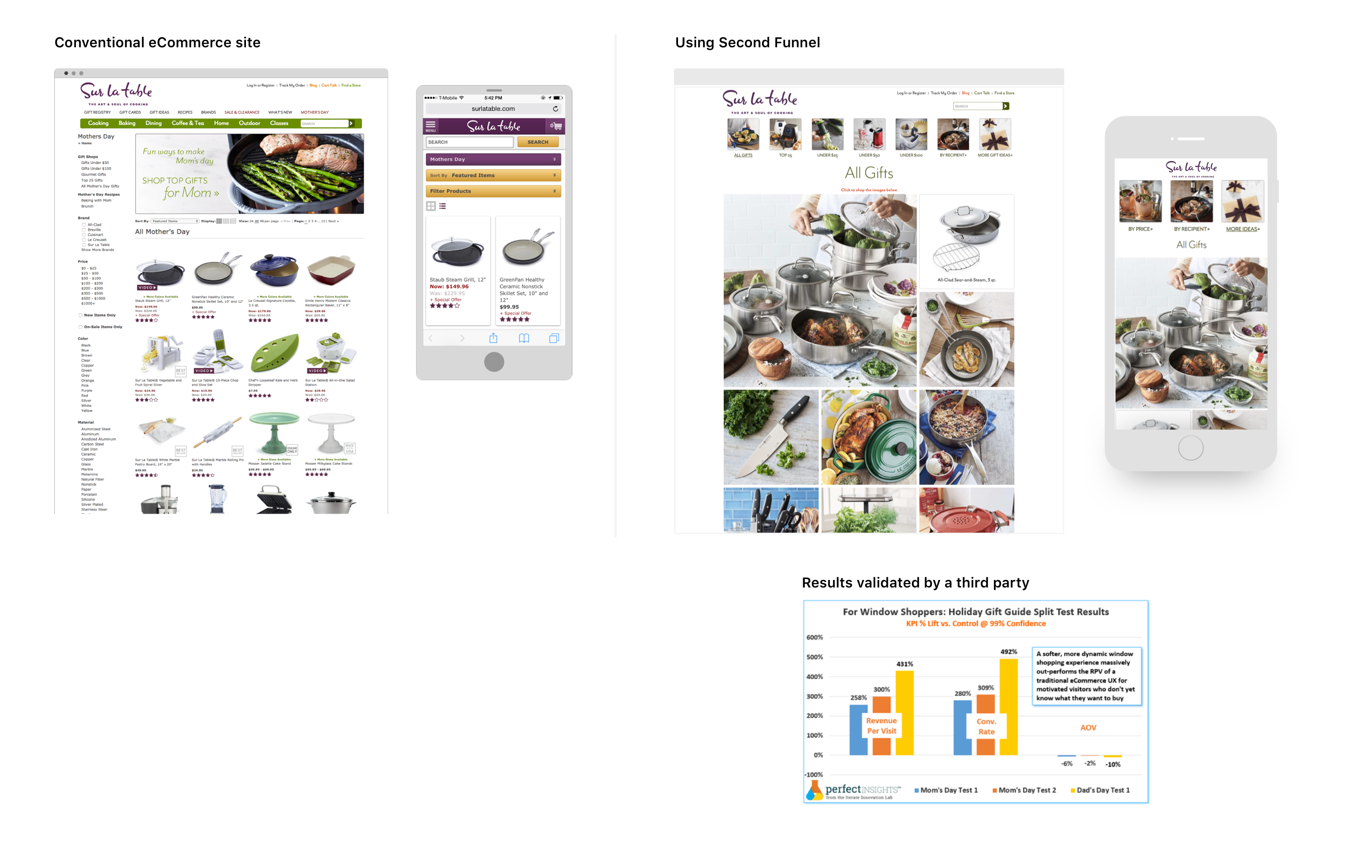
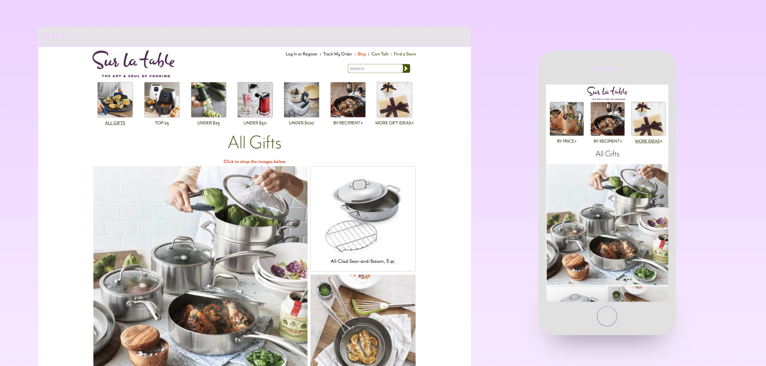
Second Funnel was used by retailers like Gap and Sur la Table, and lifted conversion rates by as much as 5X when A/B tested against conventional eCommerce pages
Problem
Time online was dominated by social media, yet social traffic converted 4X less than other sources With so much attention directed towards visual content marketing and social media, why were these channels converting so poorly?
Vision
To change the behavior, we’d need to change the environment We believed that the UX of a conventional eCommerce site totally alienated window shoppers (i.e. people who are interested enough to browse but don't have a strong intention to buy something).
We saw a need for a middle layer experience that would allow a marketer to stoke a window shopper's interest until they were absolutely ready to make a purchase.
Design Goals
- Can we create a new purchase path that ultimately increases conversion rates?
- Will marketers adopt our approach and send traffic to us instead of the eCommerce site?
User Research
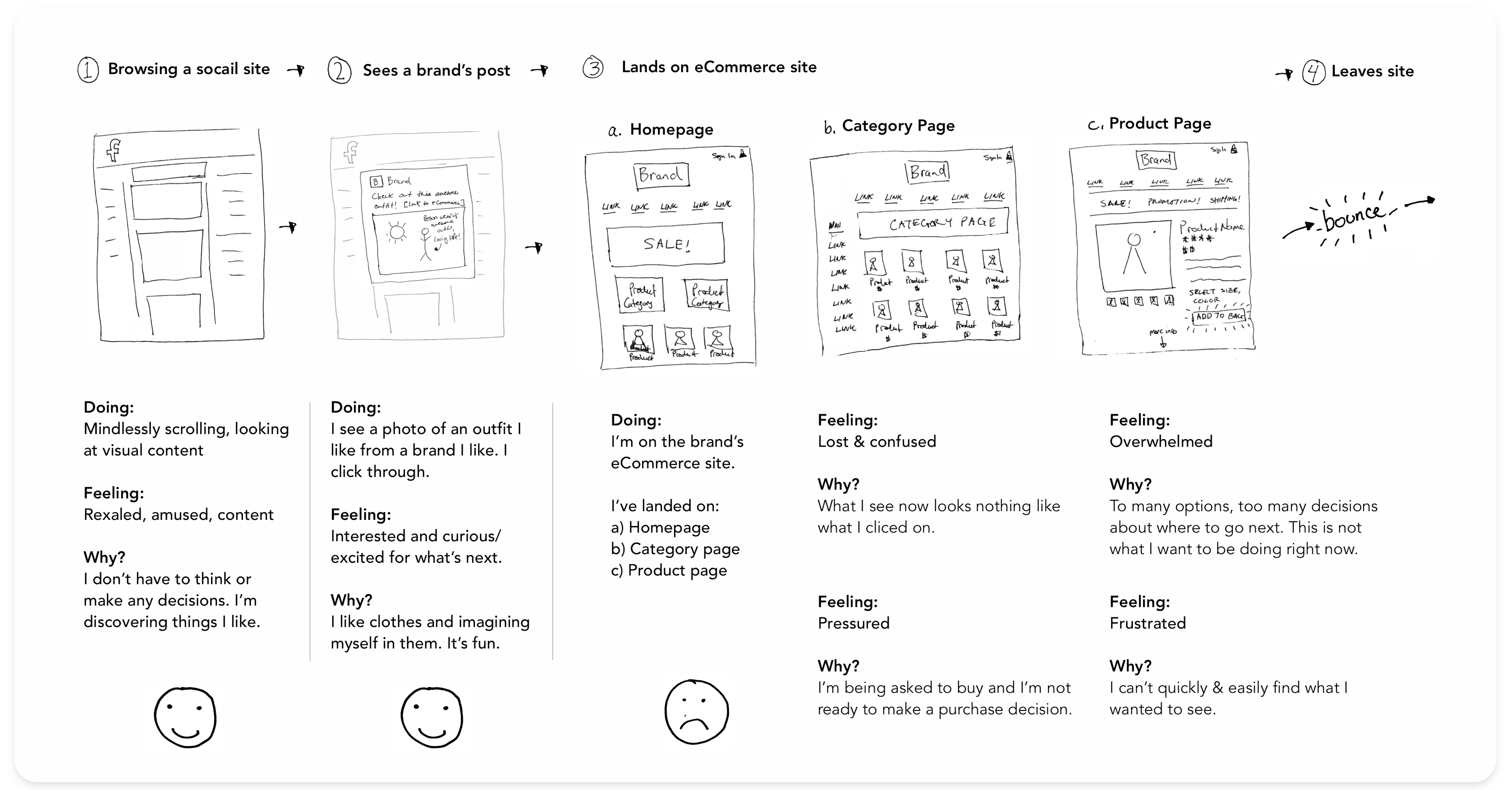
I interviewed people about how they use social media and how they shop online Watching people navigate from a branded post on Facebook to a page on an eCommerce site, I noticed that most people had similar negative experiences. I used the common pain points to guide our design explorations.
We focused on four ways to improve the experience:
- The landing page isn’t related to what I clicked: How might we create a seamless transition between entry-point and landing?
- I don’t know where to find the products I saw in the post: How might we connect branded content with products?
- I’m overwhelmed by all the navigation options: How might we create a “don’t make me think” shopping experience?
- I’m pressured by the aggressive promotions: How might we create an environment where people want to spend time browsing?
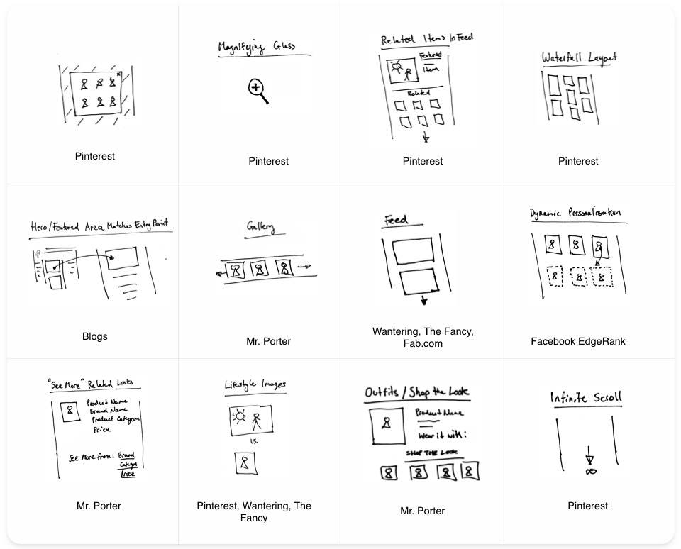
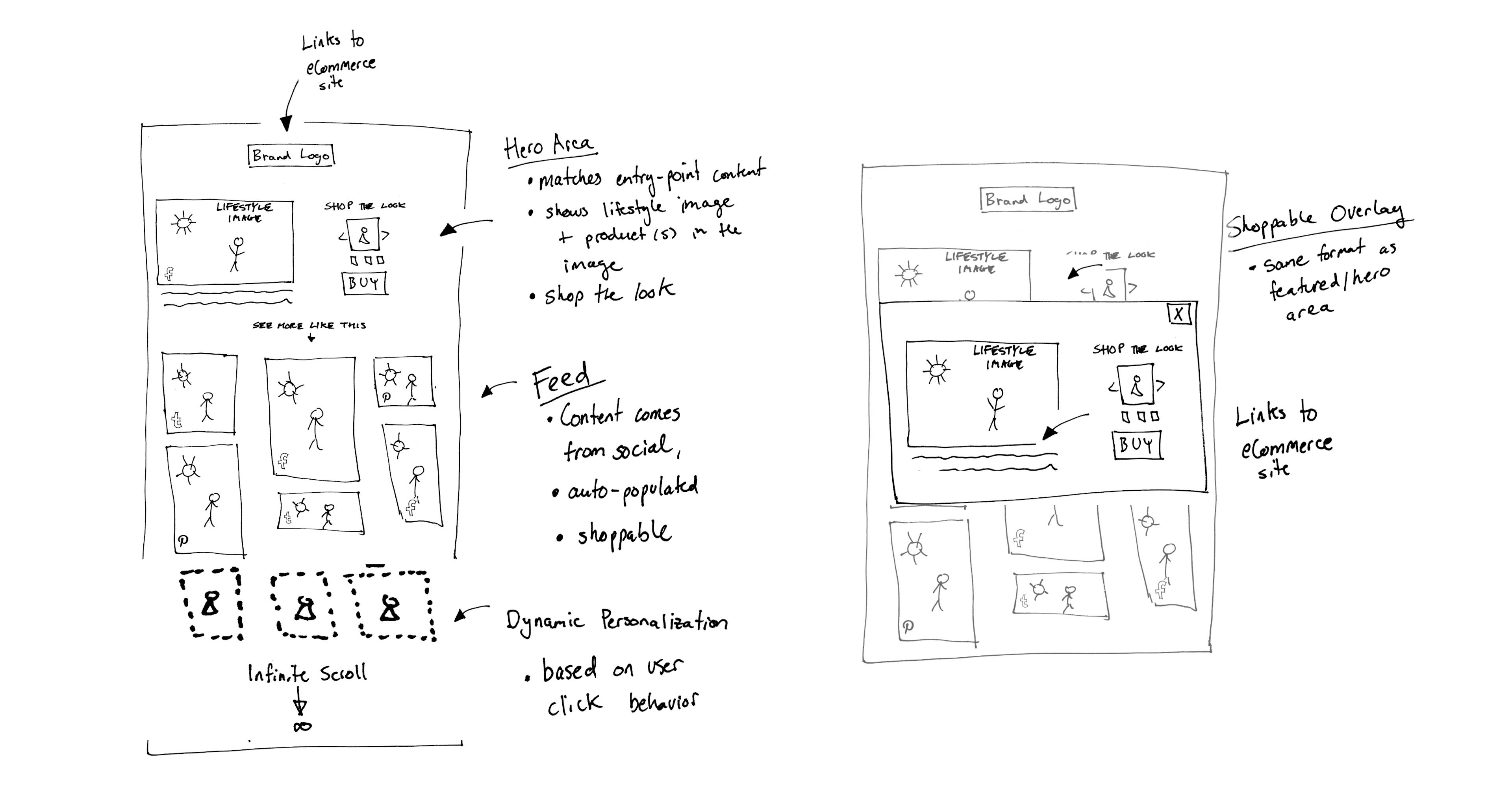
Concept Sketches
I came up with a product concept by exploring design patterns that were already working to hold people's attention in media and retail Inspiration came from image-based social media sites and lifestyle blogs and magazines—places where people were already spending a lot of time online getting inspired.
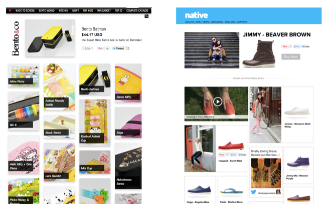
Proof of Concept
Our earliest prototypes validated that we could increase key metrics like time on site, items viewed per visitor, and click-through rates These early results were enough to help us get our our first paying customers
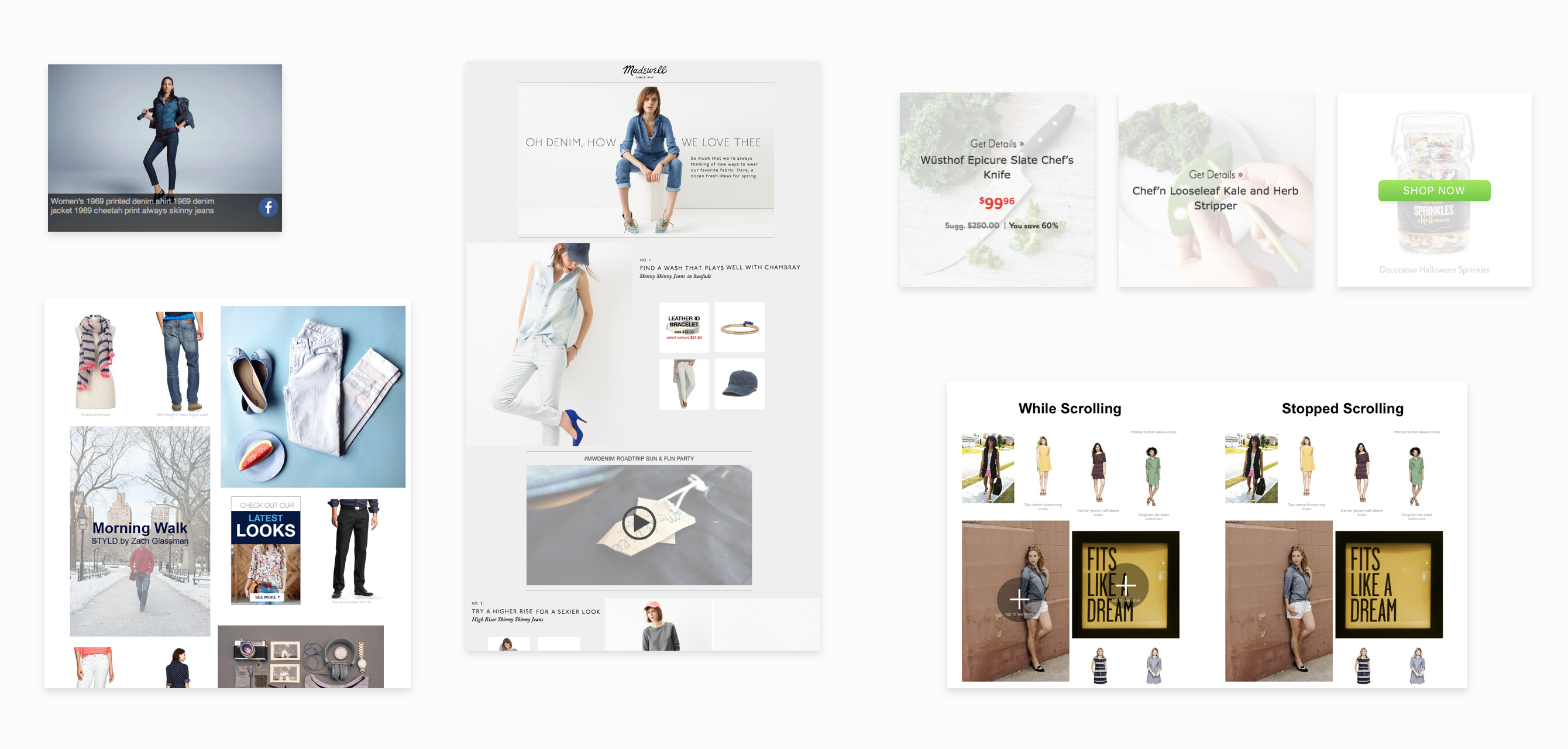
Test and Iterate
I evolved and refined the UI as we worked with more retailers and continued to run A/B tests To improve our conversion metrics, I experimented with design details like the hover state on tiles, showing information like price and discount percentages, and changing the style and wording of the CTA.
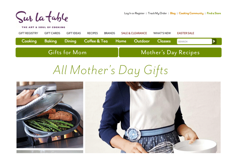
Category Navigation
I designed and tested multiple versions of our navigation, and ultimately increased the percentage of visitors who visited multiple categories from less than 10% to over 25%.
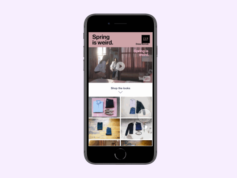
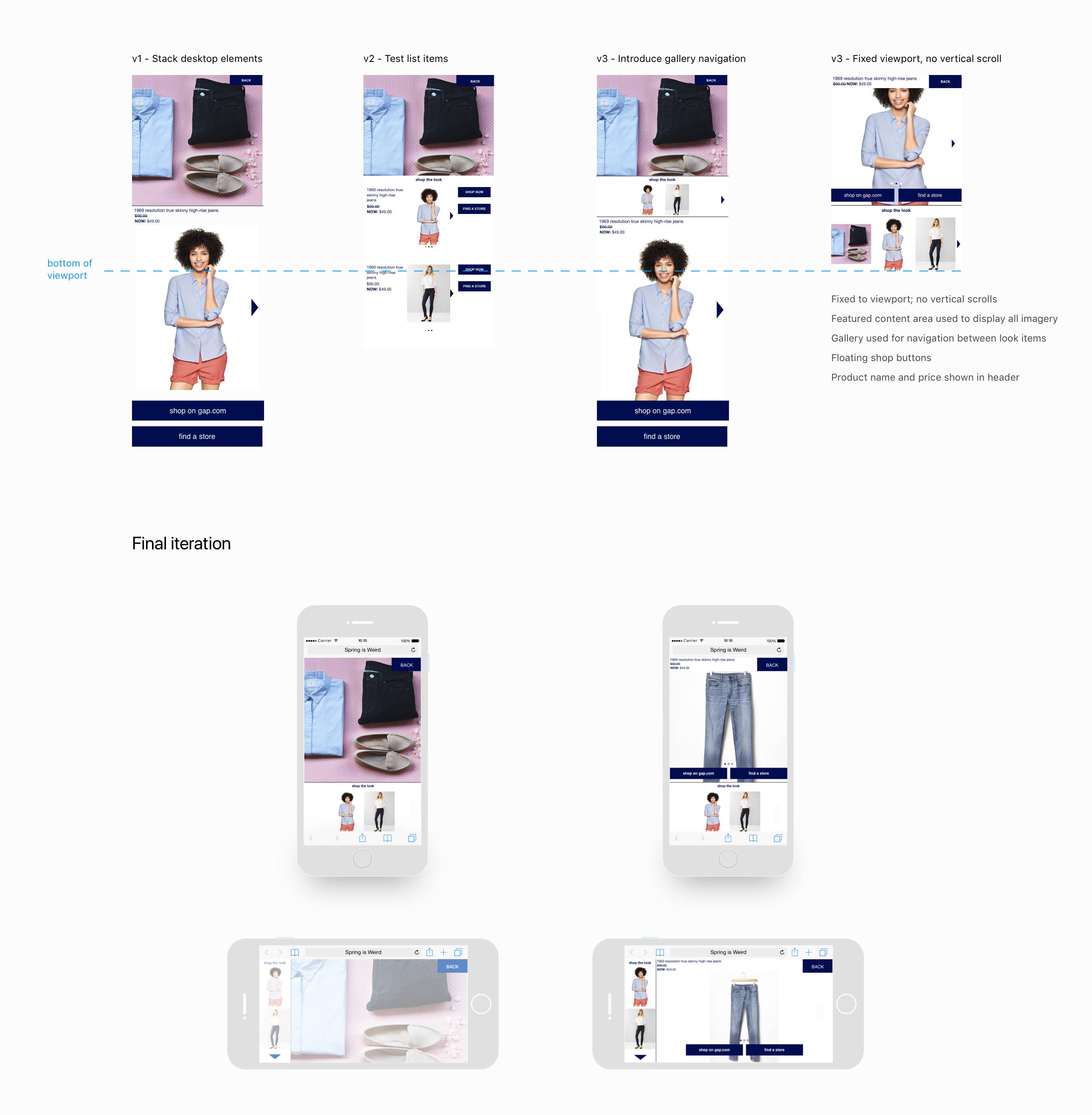
Mobile Layout
By improving the layout and interactions on our "shop-the-look" interface, I increased click-through rates from single digit percentages to between 10-25%.
Results
The experience I designed reliably lifted conversion rates by as much as 5X when A/B tested against conventional eCommerce pages